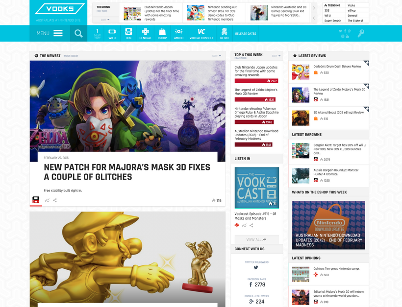
Eleven years. That’s how long the old design of Vooks had been in use, and today that all ends.
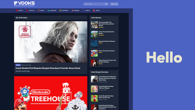
You’re now looking at the all-new Vooks, an entirely new theme for the website. There are about 200 lines of old styling left from the previous theme, and that’s about it.
The old WordPress theme Vooks ran on was a paid, off-the-shelf theme that did far too many things, with a lot of features we never used, and it was constantly slow. Over time, we sliced and diced it, removing features and other rubbish we didn’t need. But as the site has grown, the server requirements have grown with it, and the theme has remained a problem. Plus, it was starting to look a bit old, right?
This new theme boils the site down to exactly what we need and nothing more. It’s fast, it’s simple, and it’s built with modern JS and CSS. It’s how we’ll move forward without eleven years of bloat dragging us down.
So, is there anything new?
Yes, of course there is. While the guts of the site were open, it made sense to add two big features people have been asking for and that we’ve needed for a while.
Dark mode
The old site had a dark mode. It kind of worked, but it was never really finished, and it was a bit of a hack job. This site was written with dark mode in mind from the beginning. You can even leave it on auto and it’ll follow your device. Simple stuff nowadays.

Search archive
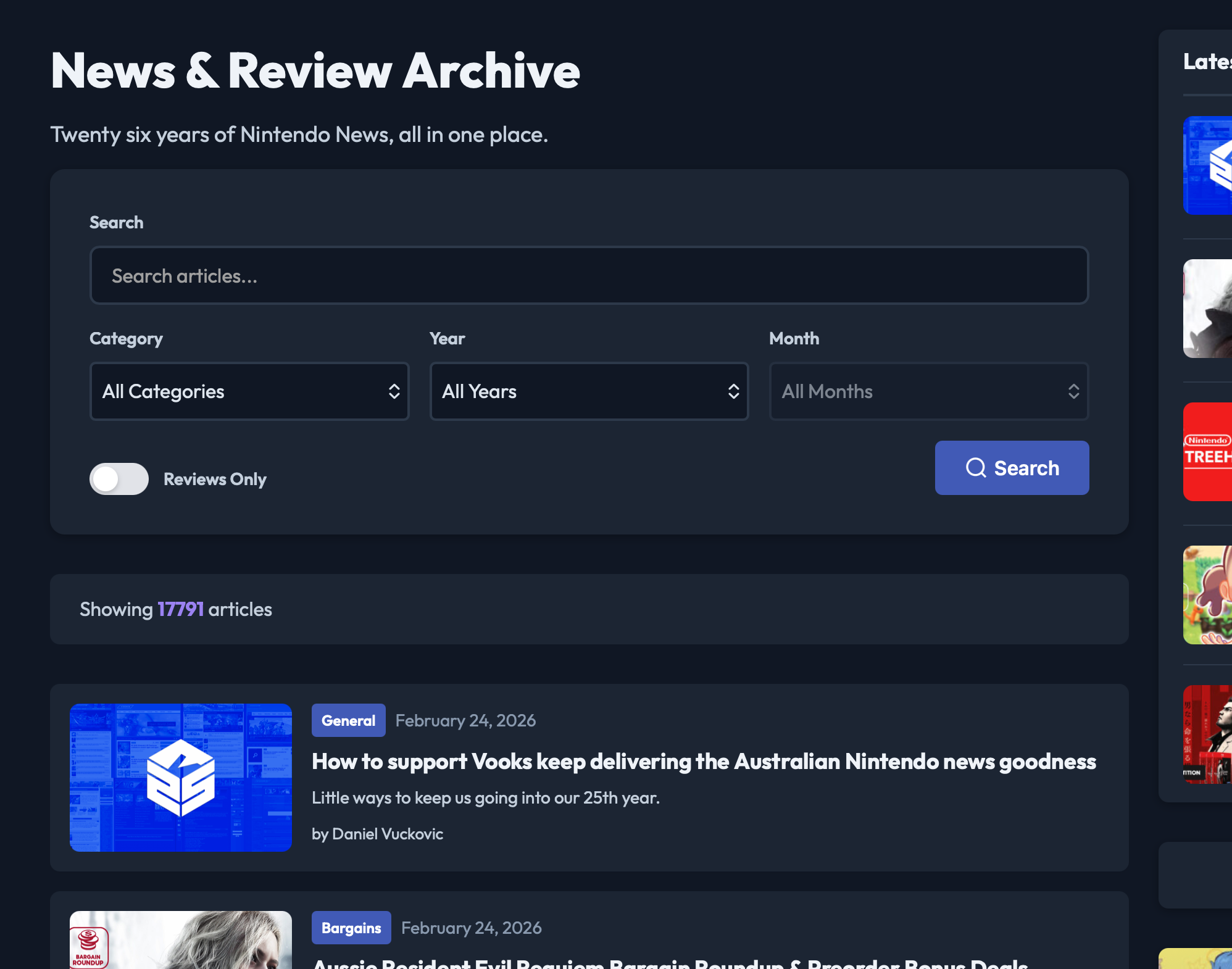
Alright, I don’t know if anyone was asking for this, but we wanted it. There are more than 20 years of Nintendo news, reviews, and everything else on this website, and on the old site, well, good luck finding it. Google can’t always be trusted to properly index the site, and our own search was woeful.
Introducing the News & Reviews archive. You can now search the site, filter by year, narrow it down by category, and toggle reviews on and off. We hope you use it, if not we will.
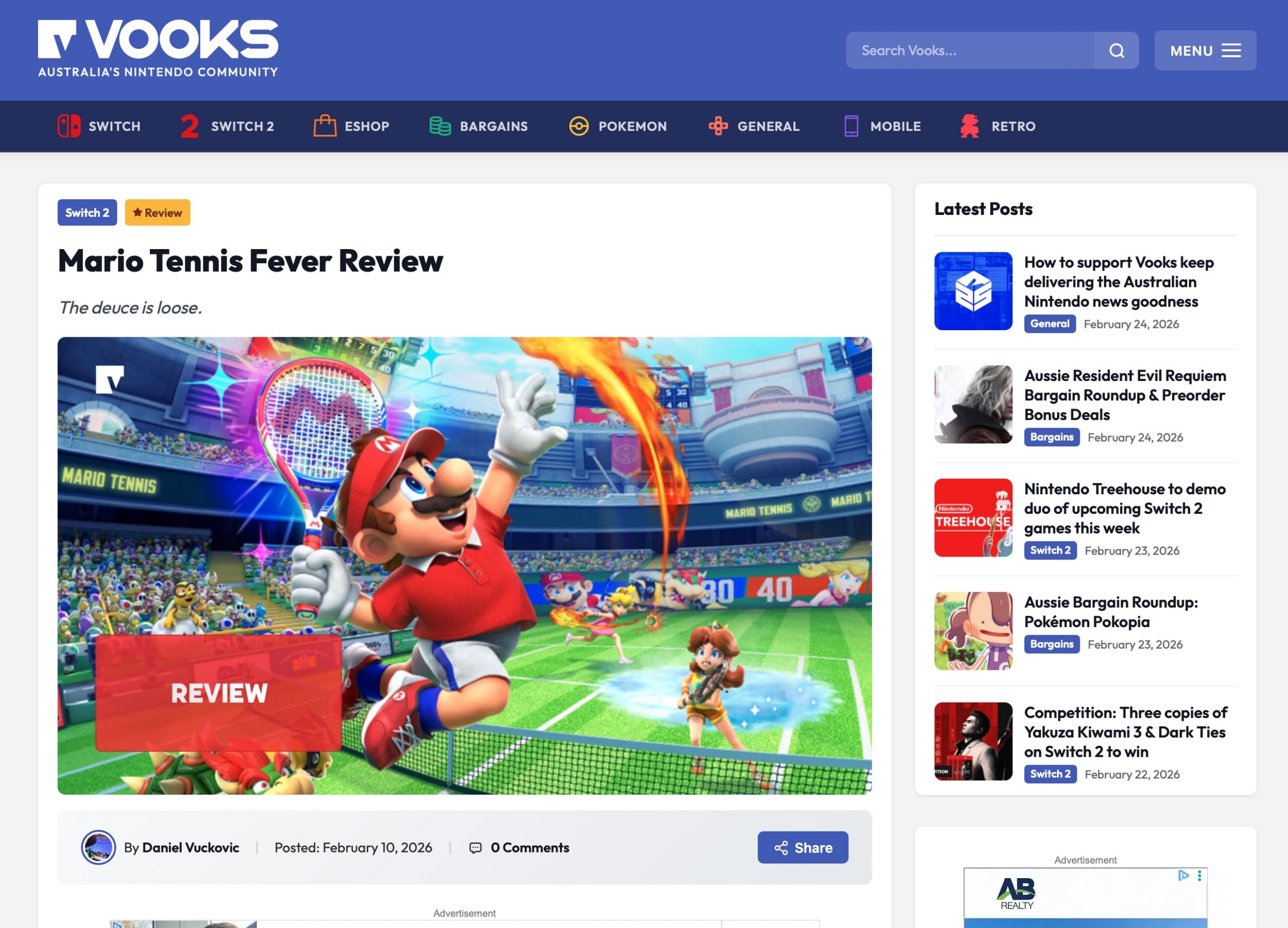
Oh, and because it’s easier to find these things, and because Nintendo are now releasing games that we reviewed 20 years ago, we’ve also added this flag to stories. That way, when someone tries to “well actually” us, we can just tap the sign.
A big thanks to the team for helping test this, and to the site’s Patrons, who got a sneak peek earlier in the week and provided fantastic feedback.
If you see an error, mistake or something doesn’t work on your computer or device, let us know in the comments. I’m sure there’s something we missed.

Looks very sleek, I like it. And the News & Review archive is a great idea!
Love the clean new look. Any reason there is no pinch to zoom on images?